VCUarts 90th Anniversary Graphics + Strategies
VCUarts has a dynamic spirit and boldness which inspires artmaking, collaboration and innovation. The branding was developed to commemorate 90 years of creative daring.
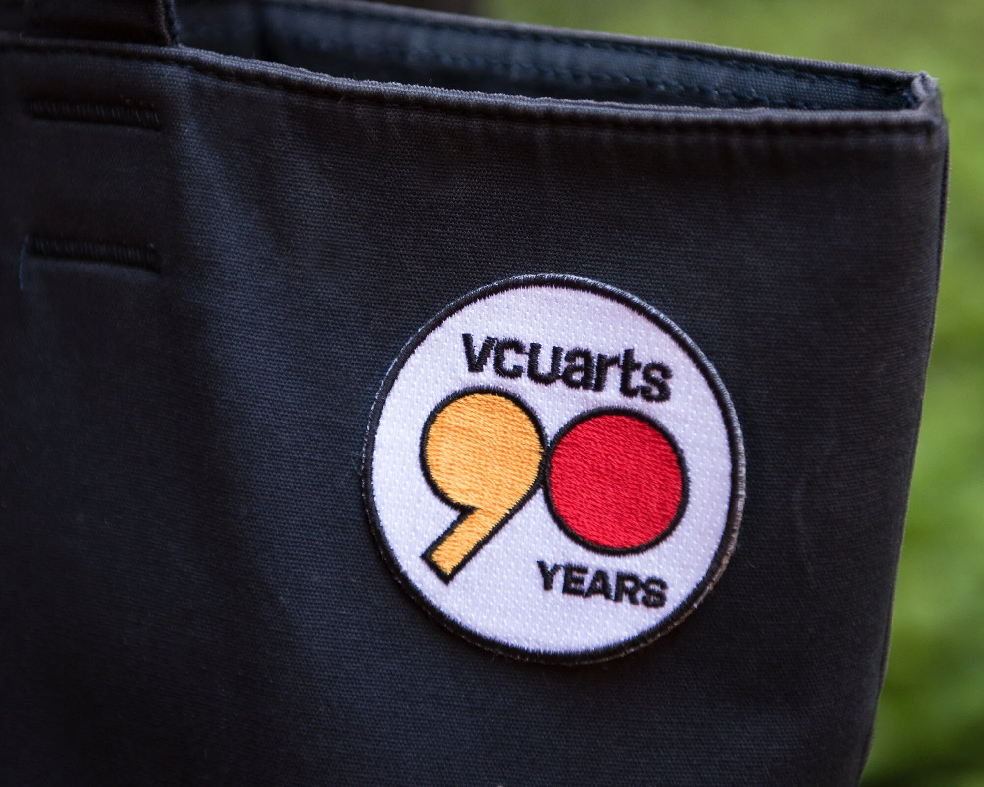
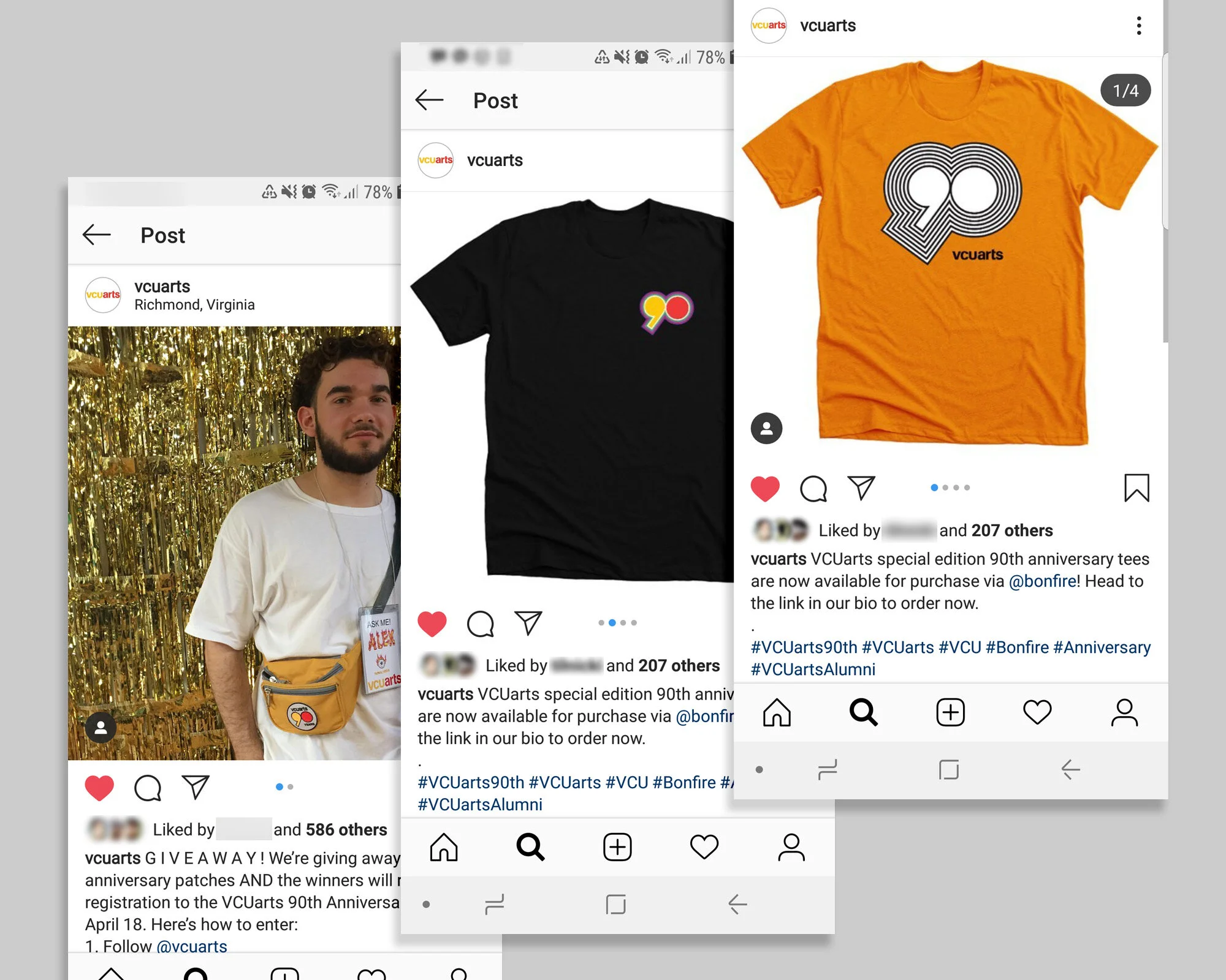
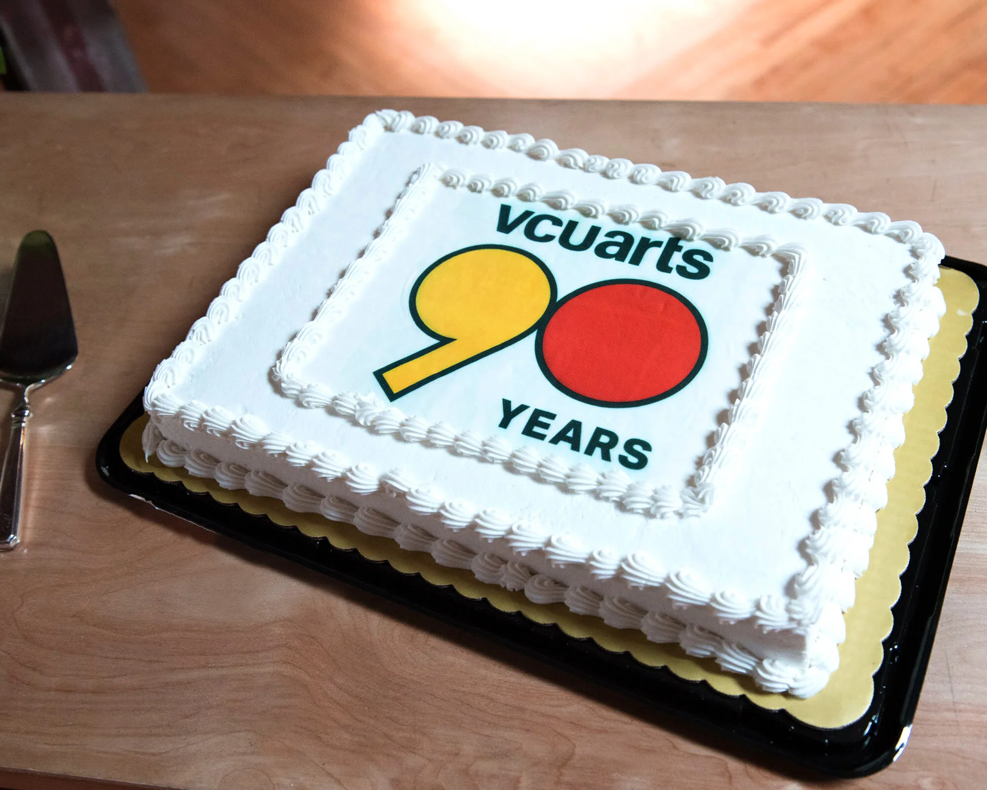
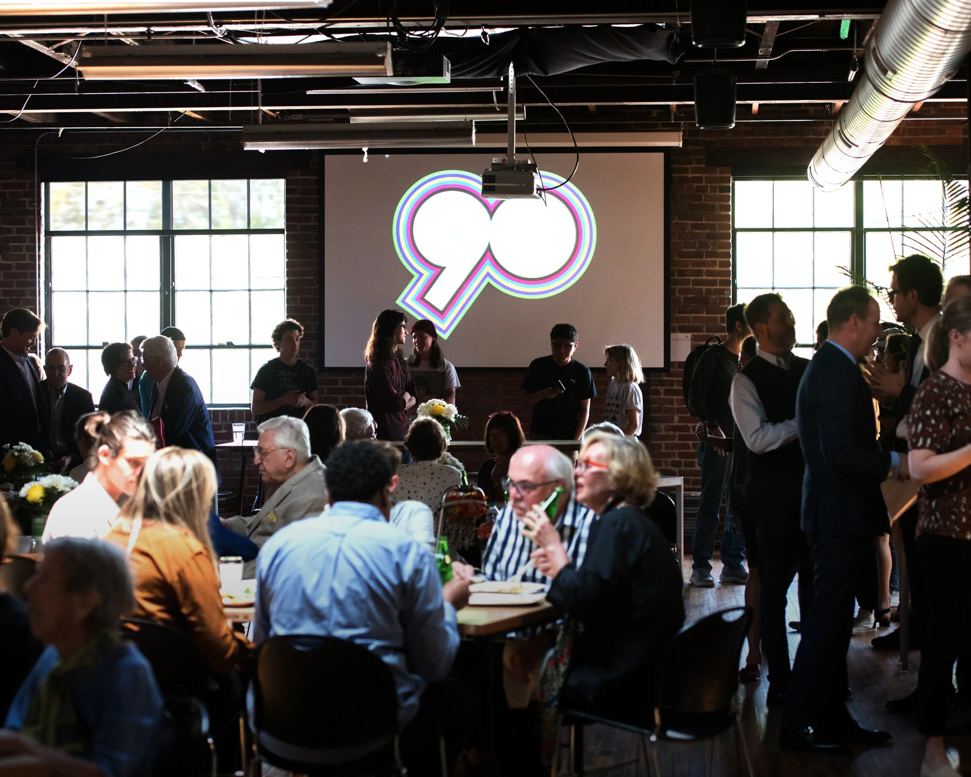
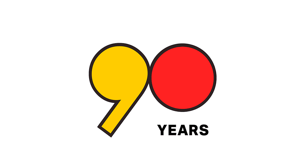
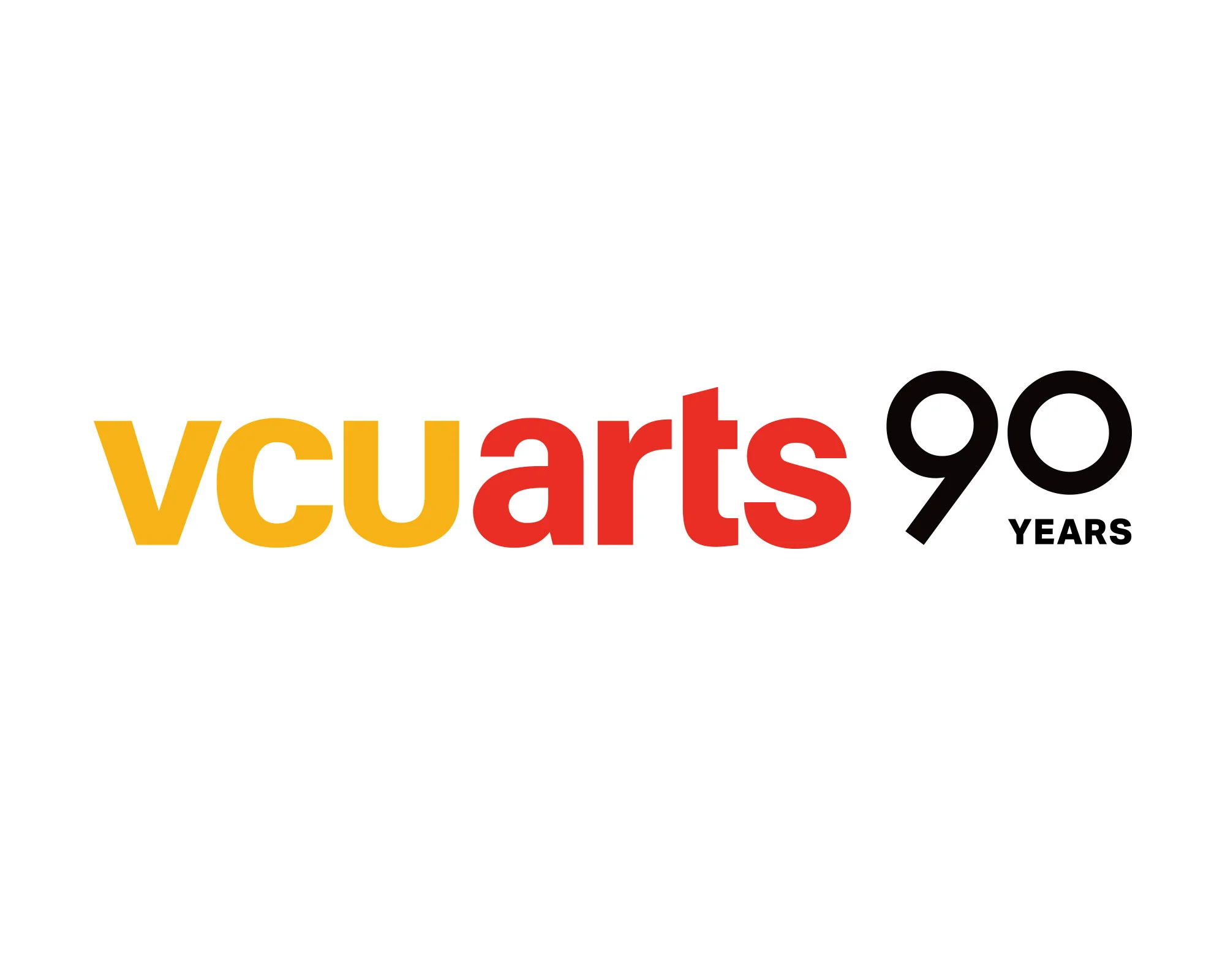
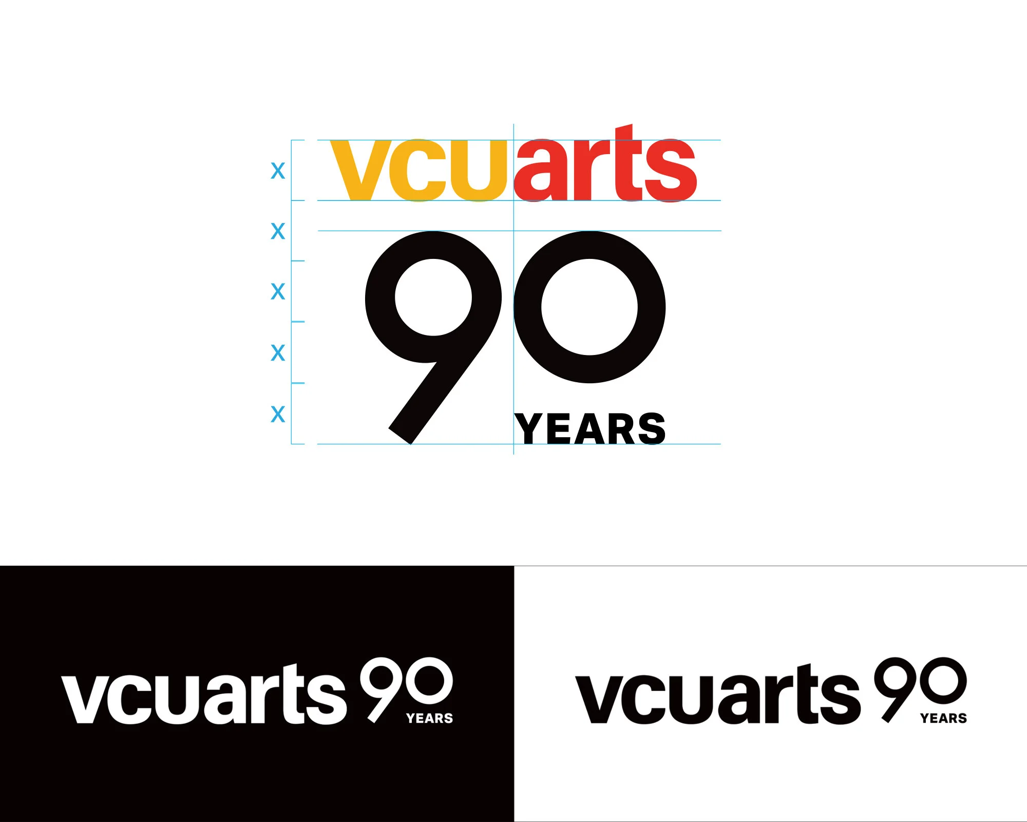
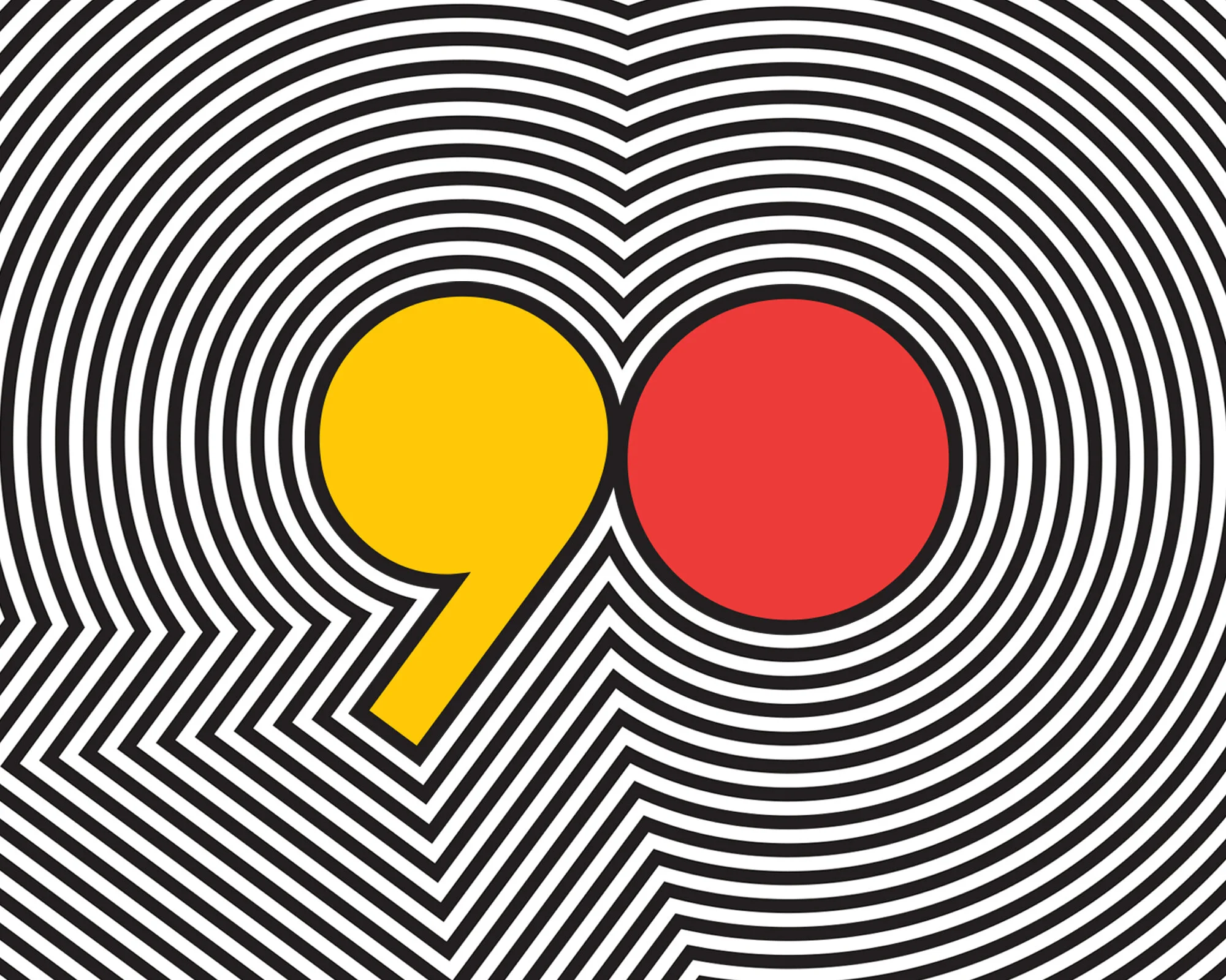
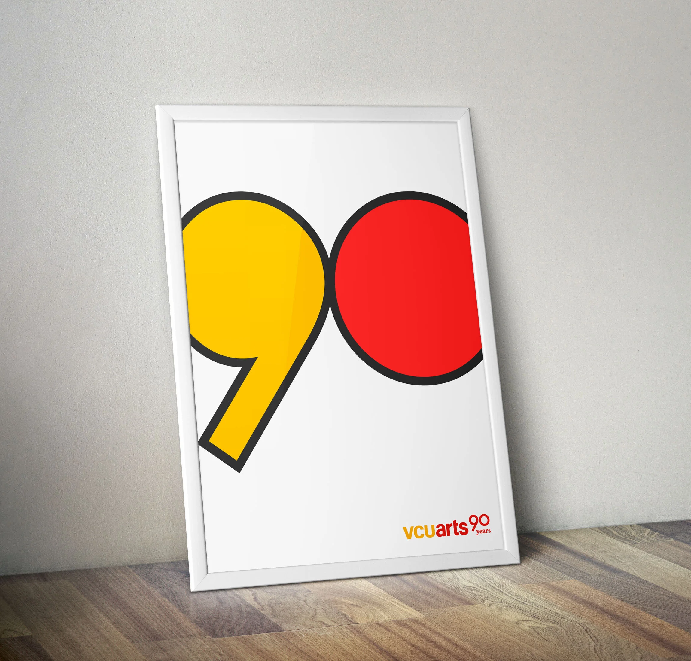
The core mark uses the original VCUarts wordmark locked up with a custom-designed 90 to represent the school’s boldness and creativity. The main campaign mark was designed to be used on more formal occasions or official communication. Yellow is a nod to the University’s color palette, and VCUarts red represents the passion for the arts. Other variations are designed to be impactful in the digital format (e.g.Instagram posts, sponsored ads, powerpoint presentations) which expands its outline with various vibrant colors. This motion represents the impactfulness of the school to the community and creative layers the school has created over 90 years.
The campaign design has been featured in many high-level presentations, anniversary celebrations, 90th stories, digital ads, Instagram posts, on a limited edition anniversary T-shirt, patches, and 8 cakes over the course of the year.
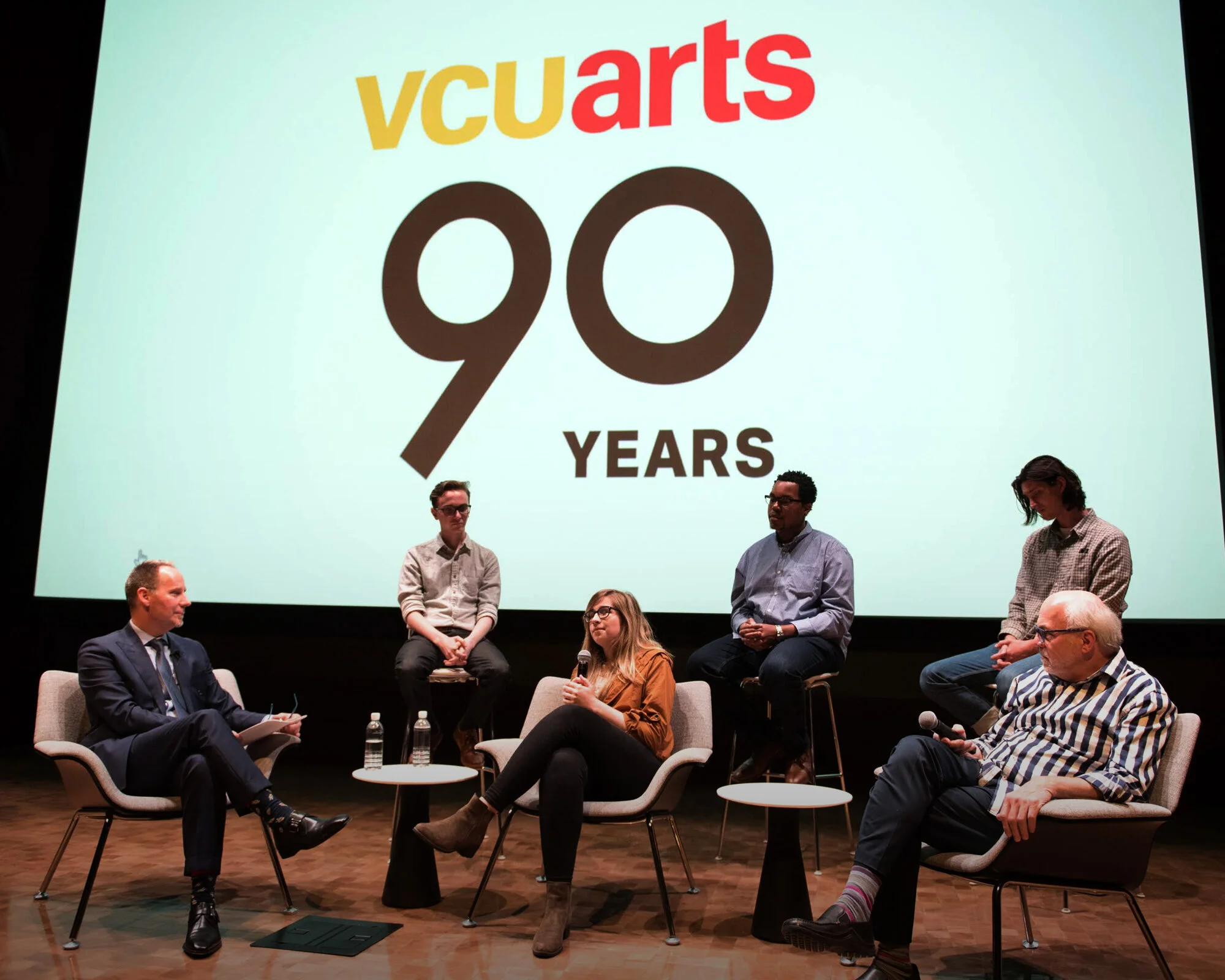
Photos by Steven Casanova